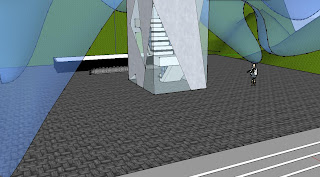
In this art gallery, I explored two concepts – curiosity and paradise. Drawn from Ron Mueck and Banksy respectively, I abstracted these two ideas into physical surroundings in space. They were investigated in relation to themselves, one another, and the artwork they were based on. During this process, the definitions of the two keywords were stretched to create the largest possible variety of interpretations. From there, they were narrowed down further when expressed in sectional form and interrelated with textures. These were connected with a stair – finalising the two notions.
The Artists
Ron Mueck, "Crouching Boy in Mirror", Reflection, Observing, Curious
Banksy, "Israeli West Bank Barrier", Paradise, Peeking, Hopeful
The Section
Top: Ron Mueck, Curious
Bottom: Banksy, Paradise
The Architecture
Draft Model 1: This was the initial attempt in creating space in relation to my section.
Draft Model 2: This was the second attempt. I tried to elaborate further in a more complex manner, as opposed to keeping it distinctively defined by the section.
Draft Model 3: This was the third attempt. I tried to distance myself from the section, and think about the space outside it.
Final Model
One of the main focuses in my model was to accentuate the two keywords through means outside the bottom and top studio, and the in-between. I used terrain and wide entrance stairs to show a "curious paradise". I feel that juxtaposing the roof to its encapsulating surroundings. It highlights how out of place and secluded the art gallery is.
Entrances to the studios are situated at the rear, with the gallery space at the front. It provides a separation between the audience and artists. Along with the ideas of curious, I applied methods for the general public to have a sneak peak at what the artists might be up to.
I felt that the most suitable texture to apply to the gallery floor was "Intertwined". It was the connecting surface between the two spaces, and where I could combine and apply opposing keywords.
The impression that I got from "paradise" and Banksy was an underground secretive area. It would be furthest from the public, and be very simple in design. The stairs leading down are industrial, and very long - to illustrate the grandeur of entering his domain. When walking up, Banksy will take a long time and create echoing footsteps - creating anticipation for people in the gallery space. From "Israeli West Bank Barrier" a double purpose skylight was added. It provides light for Banksy to work in, as well as the public to walk past and have a glimpse. The design was drawn from "Pattern Book", by Myung Dal Kim.
The texture applied to the bottom was rough, synonymous with the nature of Banksy's work. His studio and work is underground, so I thought it was appropriate to use this.
Mueck's top studio is a large, open space - functional for his art. His "curious" space is explored through the roofing and the stairs. The roof floats above him while working and undulates - while still allowing room for Mueck to work. The eye is drawn immediately to the roof, and his studio. The stairs are crafted in a picturesque manner, as he is ascending or descending the stairs.
The texture applied to the top level was "Sharp". It is indicative of Mueck and his studio space as his work is stands out - it is interesting and impressive.
References
fufu 2009, accessed 26 March 2011, <http://sketchup.google.com/3dwarehouse/details?mid=966aaf0fa6646204ca90145a1a5355a0&prevstart=0>
Google 2007, Google, California, accessed 26 March 2011, <http://sketchup.google.com/3dwarehouse/details?mid=6fc6ce57e672f74aae03309dca32a7d7&prevstart=0>
Jacky Yuen 2011, Sydney, accessed 24 March 2011, <http://arch1101-2011jy.blogspot.com/2011/03/archetypes-and-patterns-in-architecture.html>


*Thumbs Up* Good Job!! Your Mueck stairs looks awesome!
ReplyDelete